Typography on the Street
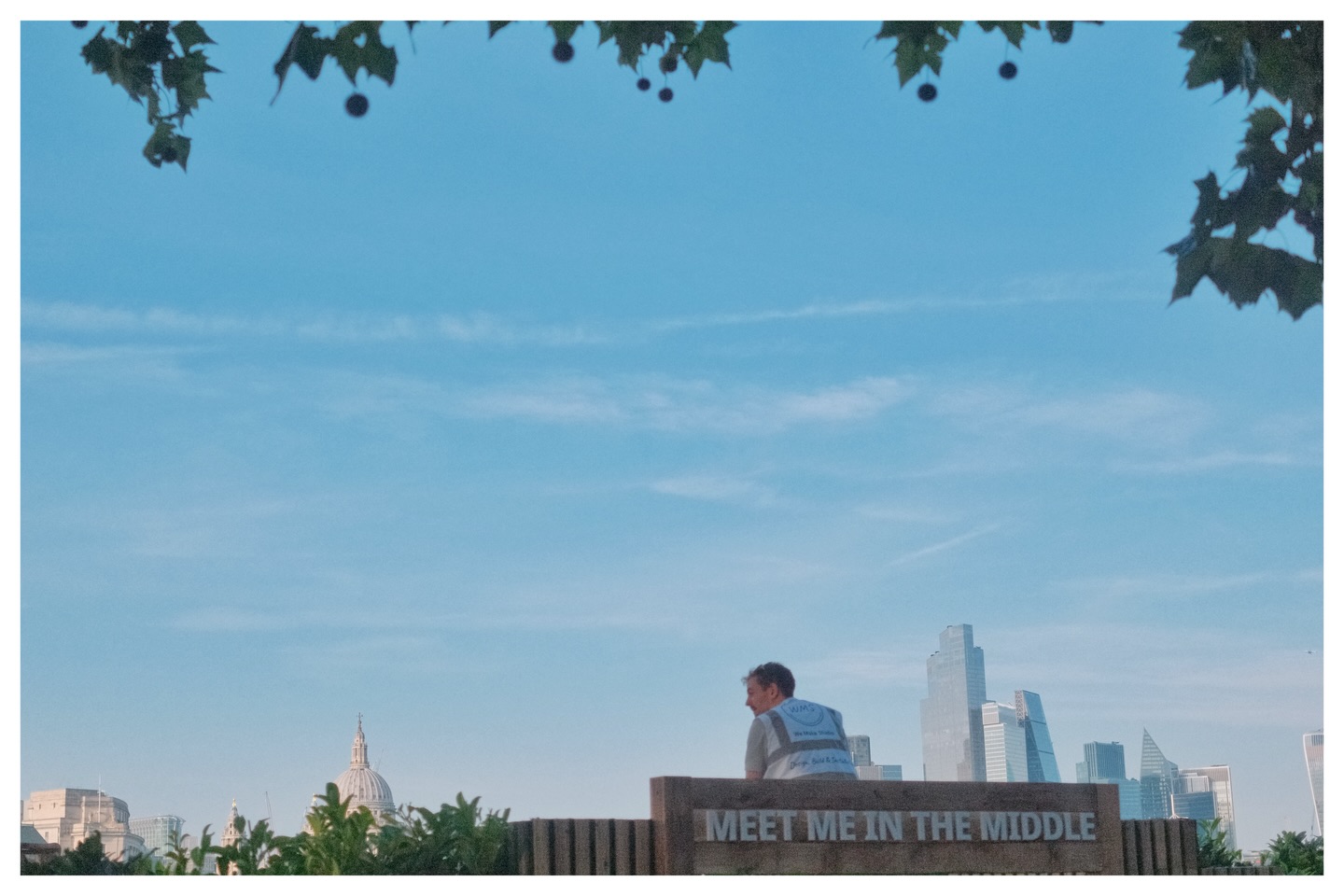
Photo: lukes.photos
The street is full of language. Shop names, road signs, market stalls, bus destinations, sandwich boards, political posters, graffiti, menus taped to windows. This text is usually invisible to the street photographer, who is looking for faces and gesture. But it is some of the richest material on the street.
Text in a photograph does two things. It places you in time and geography. A 'MIND THE GAP' sign, a Pret a Manger awning, a misspelled hand-painted sign — all of these date and locate the photograph more precisely than any landmark. And text creates irony: when the language in the frame and the image in the frame contradict each other, you have a street photograph.
The classic form: a person walking past text that comments on them, either wryly or directly. A man outside a gym with a sign that reads 'STRENGTH'. A woman walking past 'BEAUTY' in a shop window. A child standing under 'NO BALL GAMES'. These are easy to over-signpost — heavy-handed irony is its own problem — but when it lands, it lands.
The subtler approach: use text as a design element rather than a punchline. Letters as shapes. A sign used as a frame within a frame. A repeating word that creates visual rhythm across the background.
Watch for: partial text. Half a word, cut by a doorframe or cropped by the edge of the frame, can be more compelling than the whole word — the viewer's brain fills it in.
The point: once you start seeing the street as a text environment, you cannot stop. Language becomes another compositional tool alongside light and gesture.
Any. A standard or slightly wide focal length keeps text legible in context.
Spend one hour photographing the relationship between people and text. The text must be legible in the frame. Find at least one image where the text comments on the person, intentionally or not.